GoodBarber's Online Help
Header
The header (logo and title) is the upper part of the app that is always visible and accessible on all sections.
The header serves 4 purposes :
- to display your app's identity
- to give the section a title
- to display shortcuts
- to navigate in the app
1. Go to the menu Content & design > Content > Sections
2. Click "Header " from the right panel
To access the advanced settings described below, click the button Advanced at the top right corner of the panel.
Header height
General settings of your header
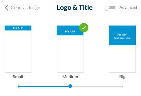
Select your header height between 3 templates:
- Small*: displays the title or the logo image
- Medium: displays the title or the logo image (only available for sections in the main navigation of the right panel of your back office)
- Big: displays the title or the logo image + the short description (only available for sections in the main navigation of the right panel of your back office)

* Other sections of the right panel of your back office + the sections listed below will always use a Small header template:
- Bag views (Bag + Checkout + Confirmation page)
- Profile + all details
- All content details
- Not found
- Login box
- TabBar other
- Comments list (Blog)
- Post comment (Blog)
- Search section
- Any Minimal templates
- Settings
- TOS Sections
HTML sections always use a Small header template.
Logo
1. The central part of the header allows you to give a title to your app or to a section. This title can be displayed in the form of text or a logo (image).
- Text: click the text to edit it.
- Logo: click the "Logo" button to add an image* in the place of text.
*Respect the minimum size requirements of 800 x 200 px.
2. Select the color and font of your title
3. Alignment: Position your logo or title to the left or at the center of the header.
Note: in the Checkout, Bag, Add address, Add card and change password pages, the logo/title will always be centered.
Advanced settings - Short description
In the Logo menu, if you selected a Big template, you have the possibility to set a short description that is shown in your header above the logo of your app.
Fill in the short description of your general header and set the text font and color.
Advanced settings - Options for the title
In the Logo menu, you can set the display options for the title. This option defines the header display strategy.
1. Select "Logo only" to always display the logo set in your general header on all your app pages.
or
2. Select "Section title & description" (Big template) or "Section title" (Small and Medium template): Update your header title depending on the page of your app that is displayed, to use automatically the title of the section involved.
To set the description of a section if you're using a Big template:
- Go to the menu Content & Design > Sections
- Open the settings of the section involved
Note: In the main navigation of your app, the first section of your list will always use the title / description of the general header.

Advanced settings - Menu & Back icons
The left part of the header is used to display the navigation actions.
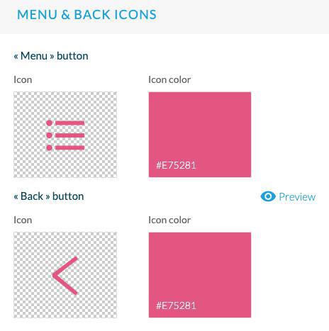
Set the design of the "Menu" button (icon + color).
The navigation menus Swipe, Little Swipe, Grid, Slate provide a menu button displayed in the header and allows to access the content.
The navigation menu TabBar this button will not appear.
Set the design of the "Back" button (icon + color)
This button is used to go back to previous sections inside your app.

Advanced settings - Header background
Select the colors of your header background.
Set a background image (1242 x 192 px) for your header background (available for Small Template only).
Advanced settings - Scroll effect
When you scroll down your app pages, you can set different effect for your header.
No effect: available for Small, Medium and Big templates.
Hiding: available for Small, Medium and Big templates; the header is hidden when you scroll down the page
Resize: available for Medium and Big templates; the header becomes smaller when you scroll down the page
Advanced settings - Actions in the header
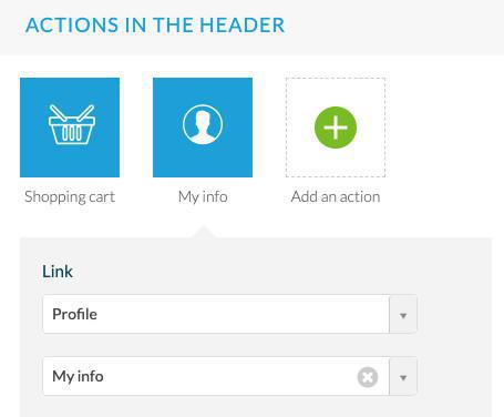
A shortcut to the cart is automatically added on the right side of the header.
1. Click it to edit its color and icon.
2. You can display a title for the shortcut for iPad and desktop. And display the shortcut in the form of a button for desktop only.
3. Set the design of the bullet that will be displayed after products are added to the cart (color of the number and of the background bullet).
To add a new action, click the green + icon and select in the link drop down menu to which page your users will be redirected when they click this action.

Note: Only 2 shortcuts are displayed in the header, if you add extra shortcuts, they will be accessible from the second shortcut (additional menu) for your users.