Delightful mobile details
Written by GoodBarber Team on
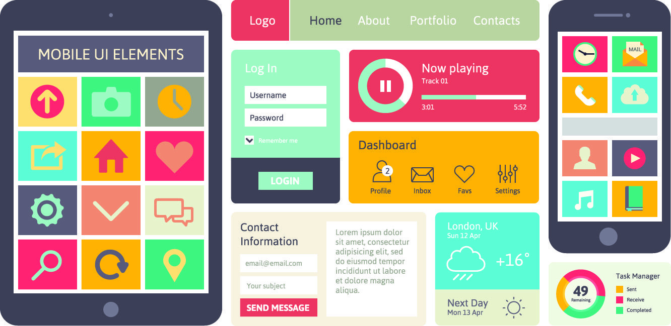
Mobile applications have experienced huge growth over the past few years. There have not only been lots of new features to improve user experience on mobile, but new and great design ideas that catch our attention with their amazing effects have been implemented as well.
Everyone has their own favorite mobile effects, and now it's time to discover some of the favorites of the members of our Beautiful GoodBarber Crew.

- The animations
Morphing the icon or visual feedback from user interaction. I've added some of this in the new Form section of GoodBarber ;)
- Blur effect iOS 8
- Transition between a list and item
For example, the visual continuity of material design

-Great user experience
The app needs to be rich in possibilities and easy to use.
When I download an app, I want to be able to immediately see all the possibilities it offers, without having to dig around to understand how to use it.
I like it when the wording is clear and it is simple to browse. A fluid and simple navigation mode is essential.
- Beautiful design
To be interesting, the app needs not only need a great content, but also to be beautiful.
Similar to the way you first appreciate a meal for its visual appeal, an attractively designed app is always more enjoyable.
When deciding between two similar apps, the one with the better design always wins.
- The ability to comment and share content
Giving users ability to comment a content can give a different interpretation of the raw content. The comment can become as interesting (and sometimes even more) than the original content.
Same when users can share a content and explain why they find it interesting. It sort of gives a second life to the initial content.

I don’t focus too much on effects when using an app.
What I value is uncluttered and intuitive interfaces.
I like also when the app respects the design of the platform. Material design for Android apps and flat design for iOS.
By respecting the design codes of the platform, your app will automatically include the cool effects the platform offers.

- Navigation facility
The navigation must be intuitive and clear. It is important to have a good feeling when using the app, a feeling as if we have created it and know it by heart! An app with a complicated menu is less attractive than an app with simple navigation :)
- DD (Dreamy Design)
Design is something important in general, but particularly in the app world. Design is half of the app. It must be simple and aesthetically pleasing in order to attract the user and make him appreciate what the app has to offer.
- Fun
Even if the subject is serious, an app must have some funny aspects. It can be anything from humor in the articles to amusing icons… Life is stressful in general, and a laugh can light up your day, so make it fun!

- Parallax effect
Superimpose more level with transparency and make elements move at different speeds while scrolling in order to create an impression of depth.
- "Wow effect"
Play with the moving effect of the elements when they appear on the screen.
- "Scrolling animated pages"
Similar to that used by Sony .

- Organization of content
It's really important to have different templates to organize the content (videos and images) in order to highlight it and simplify the navigation.
- Social connectors
It's so important to be able to connect the app to our social pages to facilitate the sharing of the content. Social connectors are a must!

Group messaging on various platforms and being able to instantly share items that I find (photos, videos, articles, screenshots) with friends.
- Personalized content
Everything on your mobile device is representative of your interests whether you have chosen these items or not.
I can actually appreciate the advertisements that appear within my various apps because they are relevant to my interests and often times lead me to things I have been searching for.

I bless the one who invented the cloud. My smartphone is my brain—everything I do needs to be stored in it. Being able to easily access any kind of document created previously on my Mac has saved my life more than once.
Another thing that for me that if well done, can be a really nice aspect of mobile, are the icons. It's not so easy to choose the right icons for a mobile app, because space is limited. Despite this, there are still many kinds of icons: realistic, flat, colorful, minimal... In this case I prefer simplicity, and a great mix of icon style and background.
I will leave the best for last: "Colors and Pattern". When I open an app, or even before, when I'm choosing an app in the store, one of the first things that catches my attention is the design, and the combination of colors. Being able to match and combine different colors and patterns is very important to give a fresh, yet not chaotic, look to the app.
