How to create an app for Newspapers
Written by Muriel Santoni on
make a News app
Beyond retaining existing readers, offering an app will allow you to get new readers and therefore increase your revenues, like the famous newspaper The Guardian which explained in a 2019 report that it gets 29% of its revenues from the users of its mobile application Guardian.
Therefore, a good news app should not be a simple news aggregator. It must be as attractive as social networks, offer high-quality content quickly, and offer new ways of monetization to its owners: you would appreciate our suggestions regarding how to make an app easily and efficiently
To satisfy the needs of today's consumers, as a media company, you need to build an app to broadcast your news in real-time .
New challenges for the press
Also, a decrease in revenues is noticeable for the press as ad blockers become more popular. Readers want to focus on content and will do what it takes to be exposed to as little advertising as possible.
Finally, the major challenge for the contemporary press is to succeed in combining the quality of the information released with the speed of publication. To get rid of the constraints of the classic written press (printing, distribution, etc.) to be able to concentrate on the relevance of the information and the fast reaction to the news, regardless of the domains concerned.
To conclude, a good news app should not be a simple news aggregator. It must be as attractive as social networks, offer high-quality content quickly, and offer new ways of monetization to its owners.
1. Choose a Theme for your News app
While your app comes automatically with a template and theme, in the back office you will find more than 25 different themes created by our designers. For example, the Focus app uses the theme Easy, while the River Daily app uses the Stardust theme. But you can choose the theme that best fits your design guidelines.
2. Build your News app Home Screen
The Home is the first screen users will see when opening your app. It is therefore an important feature of your app, both visually and practically.
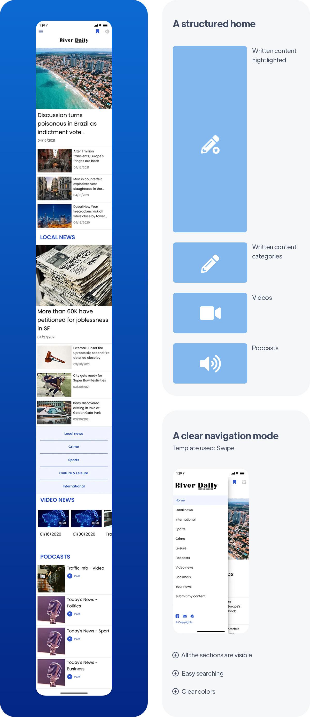
With GoodBarber, the Home lets you choose which content to highlight upon opening the app. You can see in the paragraph about UX and content how you can optimize your modular Home by adding different types of widgets. You will see further below in the article our recommendations to build your Home depending on what type of news you publish and your audience. For example, the River Daily is what you call a traditional newspaper targeting an audience used to print as well as wanting to attract a new audience. Their Home is a clear and structured homepage, with the written content provided by the editorial staff as the main focus. They use 2 blog widgets for written content like featured news and local news. This will appeal to their traditional readers. Then the video widget and the podcast widget bring a new type of content that will help them reach a new audience.
*The content that initially appears inside the app is just set as an example, you can change and adjust as you fill your sections with your own.
3. Build your Navigation Menu of your app
Here for River Daily, we’ve selected the Swipe template and added the logo within the header of the Menu, and a Copyright in the Footer area. For this app, the goal was to display clearly all sections for easy search. We also use clear colors. Your Menu can also feature links and shortcuts, to point towards destinations (internal or external), as well as titles and separators, to prioritize information within the menu (these two serve design purposes).
You can further customize your app by featuring your logo inside the Header, on the Home as well as within sections, where each section Header can be customized independently.
4. Add your Content to your news app
We're almost there! Your app will be ready soon.
5. Design your Launch Screen and App Icon
Last but not least, don't forget to enter the name of your app . The field that appears below the icon preview is the name of the app as it will appear on the Home Screen of the user's smartphone, for today's example: "River Daily".
6. Test and publish your News app
Your news app is now ready! But before sharing it with the world, you need to carry out a series of tests to check if everything is running as you've planned. You’ll need to test all versions of the app that you’re planning to publish (native iOS, native Android, PWA, etc.), using different OS and different browsers as well.
GoodBarber provides a test app you can use to run preliminary checks on your app. The most optimal way to test your app, however, is through its AdHoc version, which is the actual file of the app that will be submitted to the stores that you can download onto and run on your device. Other options are available: For native iOS apps, there is a specific tool provided by Apple: TestFlight. It allows testing your app before it goes online on the App Store. Android offers alternatives to Testflight.
Once you’re satisfied with the results of your tests, you can move on to the next step: publishing your app !
Publishing an app can be a complex and slightly overwhelming process, starting with the mandatory step of registering as a developer on both Android and iOS platforms. The Apple developer account is $99/year. The Google Publisher account consists of a one-time fee of $25. Keep in mind that Apple requires the owner of the content in the app to match the owner of the developer account, so if you publish multiple iOS apps for different projects, each will need to have its own individual developer account.
The process of submitting an app to the App Store is slightly complex and requires thorough preparation. Apple reviews each app before approving them for release. Before you submit your app for review, you will need to provide a collection of information (Icon, app preview/ screenshots) and metadata (the name of your app, its category, a detailed description, and additional keywords for ASO). The review process can take a few days, Apple will notify you by email when your app is public.
For Google Play, after creating your app on your Google Play Console you will need to register the information that will be displayed on Google Play. It includes mandatory information such as title, short description, full description, graphic assets (pictures, app screenshots), category, contact details, privacy policy. Once the Store listing is completed, it’s time to upload your app bundle. (it contains all the elements of your application). Then follow the guide on the Google Console to deploy and publish your app. If your app is approved it will be released within a few hours.
Luckily, publishing a Progressive Web App is a lot simpler. Hosting is included with your GoodBarber subscription. However, we highly recommend purchasing and setting up your own domain name. It will help your newspaper gain visibility and create brand awareness. Also, you want your readers to easily find you!
Now, let's dive a bit deeper into the creation of a news app with the examples of 3 apps: River Daily, Focus and Angelina Magazine.
Content and UX: Identify your audience and its needs
news app Android / iOS for traditional readers
Indeed, you need to define the topics that interest your audience but also the profile of your readers and their information consumption habits. Your app must meet their needs by taking into account these two dimensions. Here are some examples of different apps that meet the needs of different readers.
1/ General news apps for conventional readers
The River Daily news app is an app created for a regional newspaper. It targets so-called "traditional" readers who were or still are used to consuming print media. To keep these readers loyal and attract the new generation, the newspaper decided to diversify by offering different types of content such as short videos and podcasts.
In order to meet the needs of these two target groups, the newspaper has opted for a clear and structured homepage, with the written content provided by the editorial staff as the main focus. All categories of topics are represented both on the homepage and in the navigation mode. Further down, we find the new types of content, present but less highlighted.
The navigation mode is very uncluttered in order not to confuse the information and to facilitate the search and navigation in the app.

make a news app for Millenials
In the case of the Focus app, the challenge is to attract the attention of a young audience, used to social media news feeds. The information is presented in a clear and concise way. The design of the app must be striking and it must be easy to find your way around.
The homepage was built in a very visual way by choosing templates with large images. Each category and type of content is represented with a clear title and an associated color to help the eye to sort the content unconsciously.
Written articles are deliberately short and punchy, while the emphasis is on more easily consumable content such as podcasts or videos.
Links to social media are highlighted on the homepage of the application, and a direct link to the collaborative features of the app is present in the main navigation mode. The latter has been deliberately chosen to be concise and visual thanks to its icons that allow you to instantly locate the section you want to consult.

create a news app for experts
To represent the more specialized news apps, the app Angelina is the right example. Dealing with fashion, it is aimed at enthusiasts, often already experts or professionals in their field. As fashion can be related to art, it was essential to offer an app with a sleek design and a home that was very much identified with the colors of the magazine.
The choice of colors was made in a rather neutral palette in order to highlight the magazine's logo and allow the reader to immediately immerse himself in its universe. The homepage is very long, with an overview of each section and each category of the magazine. In addition to the Search widget, this allows the reader to have a quick and global view of the fresh content offered by the magazine, but also to easily find specific content. The chosen templates are very visual, which is a major expectation of readers of fashion magazines.
For the navigation mode, always in the same spirit, a full-screen template was chosen, reminding the famous summary of the paper press. In order not to suffocate the menu, some sections have been grouped in sub-sections, allowing once again a navigation as fluid as possible.
Key features for a great news app for Android and iOS
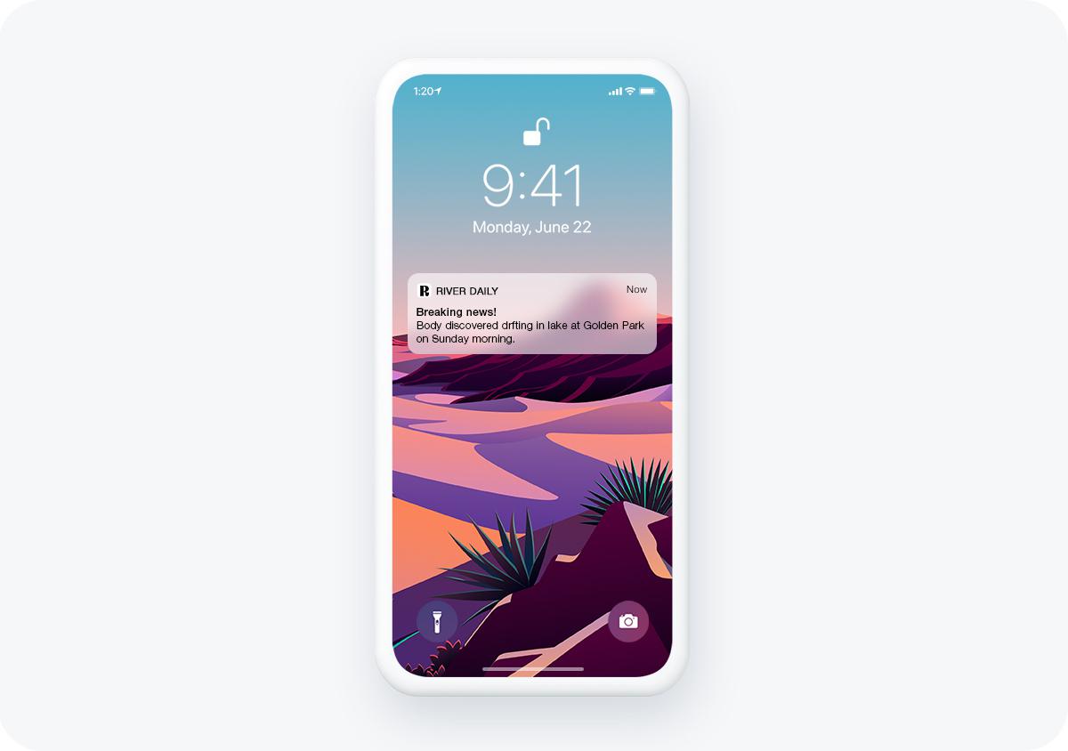
Push Notifications are essential for a news app
GoodBarber offers a CMS to write your content, and connectors to sync it from external platforms. You can easily create and publish content in different formats: articles, podcasts, live video streaming, images, map, or events. In addition to that, more than 30 connectors are available (WordPress, Youtube, RSS, Podcast Feed, Vimeo, Twitter, among others), in order to synchronize the content that will be formatted to match the display standards and design of your app. You won't have to worry about double-publishing.
Push notifications to engage your readers
With instant push notifications, you'll be the first to share the latest news with your readers. Simply write and send the latest news in one click from your GoodBarber back office. This feature is crucial for a news app that needs to be responsive and reliable to inform its readers.
Finally, with personalized push notifications, your readers can select the type of push notifications they want to receive. They will only be alerted to topics that are relevant to them.
Revenue generating tools:
In the case of an app, there are two monetization options perfectly suited for news apps.
- Displaying ads in your app: this is the practice of displaying ads at appropriate times throughout the user experience of your news app. There are several ad formats that need to be considered and tested for the best results. For example, you may want to test the success of banner ads or interstitial ads. You should also consider the impact of these ads on the user experience, testing the frequency to find a balance between generating revenue and providing the best possible experience for your users. You can choose to display ads from 4 major ad networks (Admob, Ad Manager, Google AdSense, and Facebook ads), or create your own ads, giving you the ability to sell ad slots in your app.
- Subscriptions: in this case, your news app will only be accessible after subscription, offering some features for free while giving users the option to upgrade to a paid subscription for full access to your app. Using a subscription model is a great way to introduce your product to new users and show the value of your news application before they commit to a subscription. It is the easiest way to monetize your app.
make content interactive within a news app
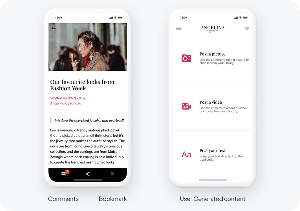
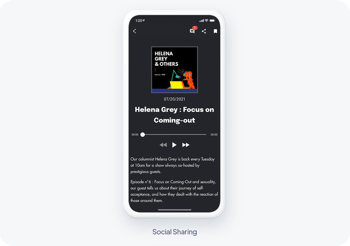
Your readers should be able to interact with your content by commenting, sharing, or saving content for later. These tools make your content more interactive, increase its chances of going viral and allow users to come back to the content they find interesting.
- Comments: Enable comments on your articles and give your readers a space to make their voices heard and be part of a community that shares their interests.
- Favorites: Your users can save their favorite articles or podcast episodes and return to them later. The best user experience for your most passionate readers.
- UGC: Sometimes news comes directly from the public. Get your users' views or even the latest news with user-generated content. They can send their content in 3 different ways: Text, photos, or videos.
Best practices to follow
make a news app content easily accessible
For best results, manage content into sections that users can follow, browse, and choose from in custom push notification settings. Sections can be grouped into Menu sections to create multi-level navigation in your app.
Organizing your content into categories or categorized sections will make it easier for users to discover content that matches their individual interests and needs. Categories are also useful for suggesting content to users that is similar to what they have already read. This can result in increased page views and session length.
Provide a search engine:
This is especially important for news apps as it will allow your readers to find relevant categories, topics and articles according to their interests.
Avoid misleading titles in your push notifications:
It is always important to be transparent with your users, but especially when sending push notifications. Users want to be notified with clear headlines with an option to learn more. You need to avoid making your readers feel like they've been tricked into clicking on your notification if you want to avoid a wave of unsubscribes.
Encourage users to share your content:
You should allow users to share content they find interesting on social media. The goal should be to make sharing content as easy as possible, allowing readers to share your content with a few clicks. Native sharing allows you to transfer any link or image to another app or platform (Facebook, Twitter, Instagram, and many others) without ever leaving your app.