How to create city and tourism apps ?
Written by Marie Pireddu on
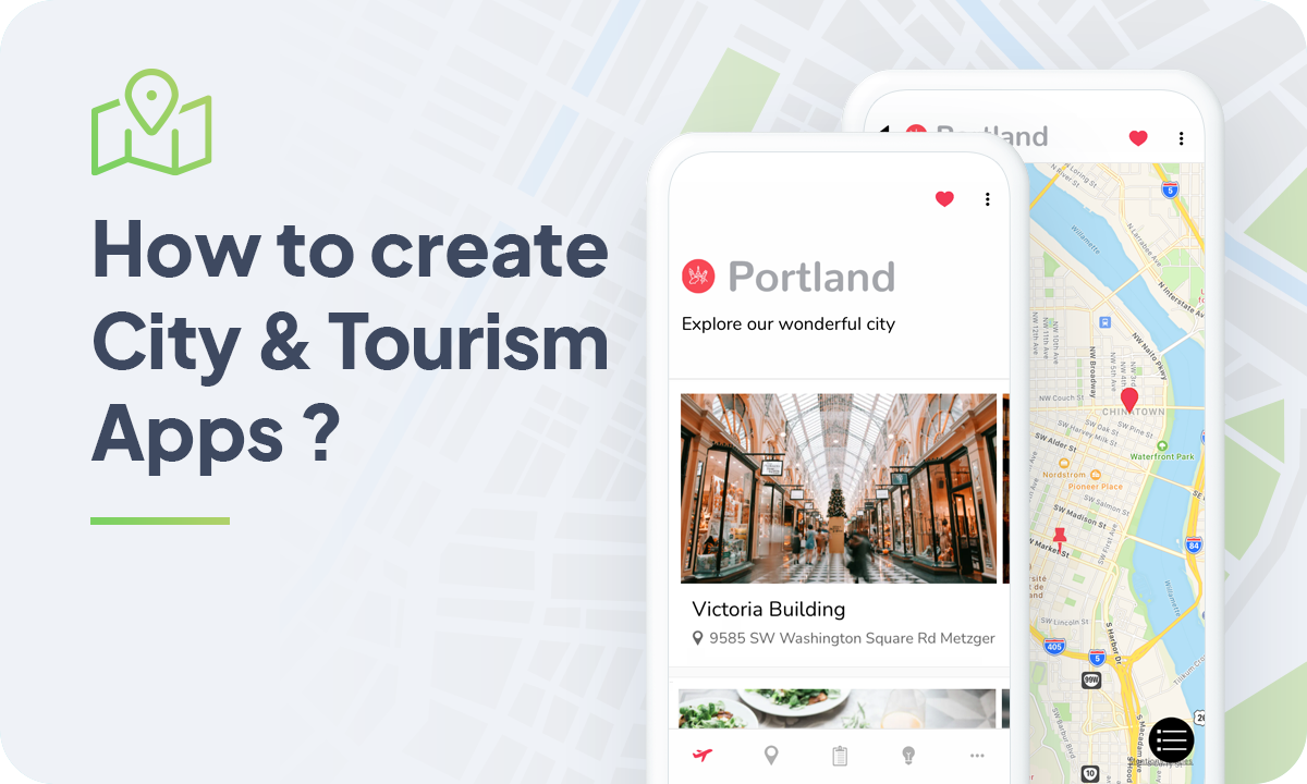
Cities & tourism
On top of their pocket-format, a Travel app provide valuable information so that the user can plan his travel arrangements, places to visit, what to do in a particular place or situation, etc.
You may have already wondered about how to make an app, and thought it would be a hard process. However, with this guide you are just one step away from creating an app for the travel enthusiast, accessible across devices, using GoodBarber.
Just one information before we get started, being a free spirit, my City Muse for the day will be Portland.
But of course, you are free to apply all the tips you'll find here to any city, region or location.
1. Choose a Theme for your Tourism app
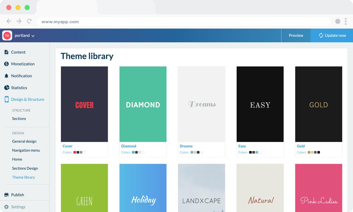
Theme library GoodBarber
In the back office you will find more than 25 different themes (and counting) created by our designers that can be used as a starting point for your application.
If you want, you can also enable a classic "White" theme and make all the adjustments you have in mind.
For this app I decided to start with the theme "Budapest”, but as I said earlier, you can choose the theme that best fits your design guidelines.
2. Build your Tourism app Home Screen
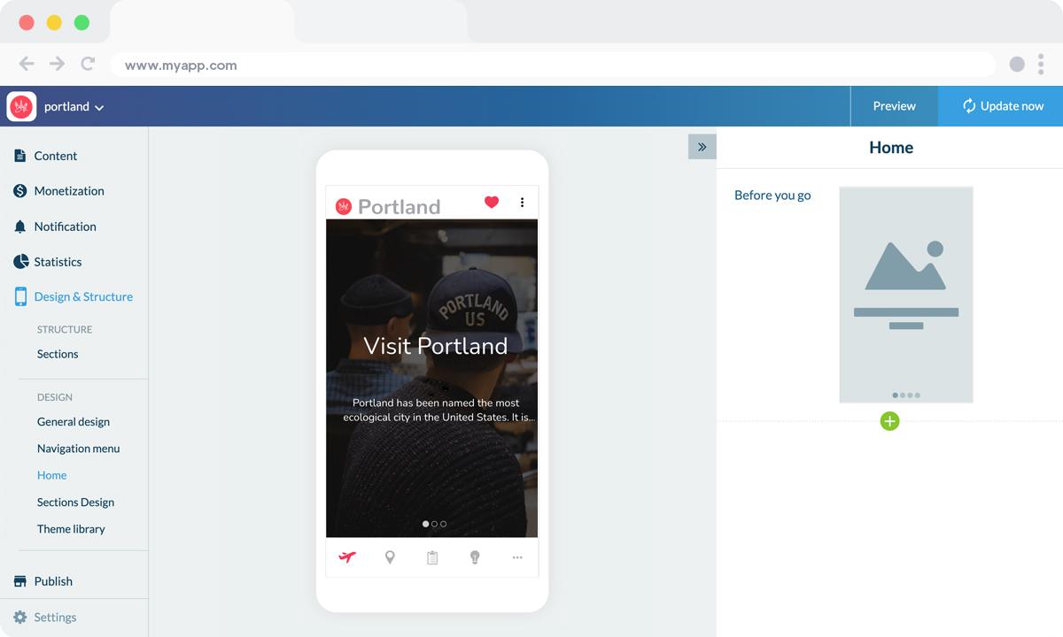
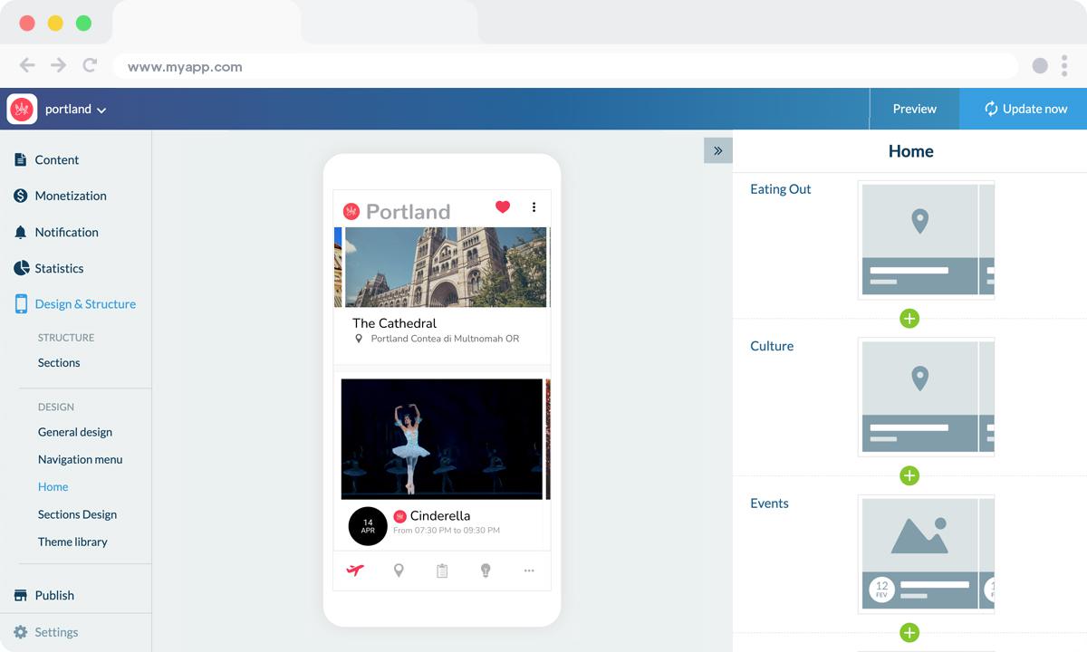
With GoodBarber, the Home lets you choose which content to highlight upon opening the app.
With a destination app for instance you can decide to feature useful advice to visit your city within the first widget.
The modular Home introduced by GoodBarber 4.0 is made up of two different kinds of widgets, content widgets and navigation widgets (links)—a total of 66 widgets has been developed so far.
Templates associated with widgets have a mobile, tablet and desktop declination.
Here you can see that we’ve added our first widget, a Content widget, to feature an mCMS articles section (a Before you go article) :
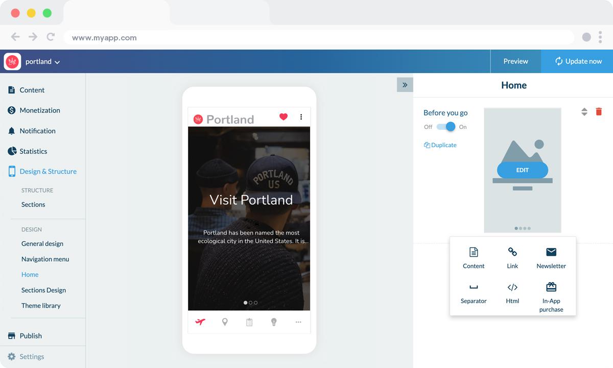
After selecting a template (Banner > Minimal), we added another Content widget with a different display (Banner > Visual) to feature another mCMS articles section called Shopping:
3.Build your Navigation Menu of your app
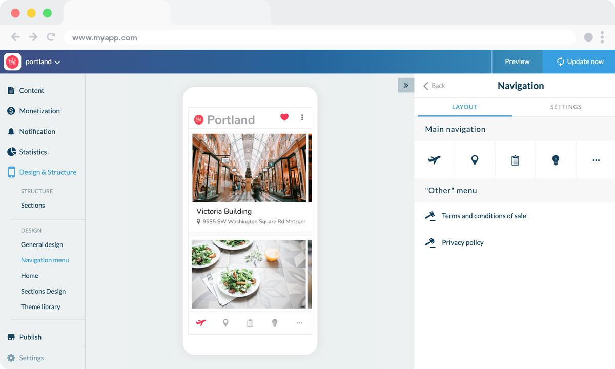
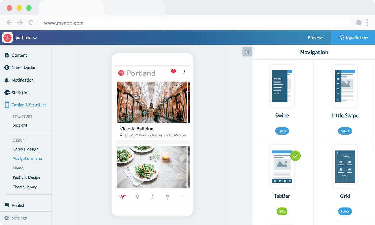
Your Home already provides points of entry towards the sections of your choice, which is why you can even choose the option to not display a Menu at all.
f you do choose to enable a Menu (or Browsing mode in your back office), you can choose between 7 different types of "menus" or browsing modes, to further distribute traffic within your app.
Building the Menu can be achieved independently of the number of sections in the app for complete control over the navigation of your app.
Here we’ve selected the TabBar template and added our logo within the header of the Menu, and a Copyright in the Footer area:
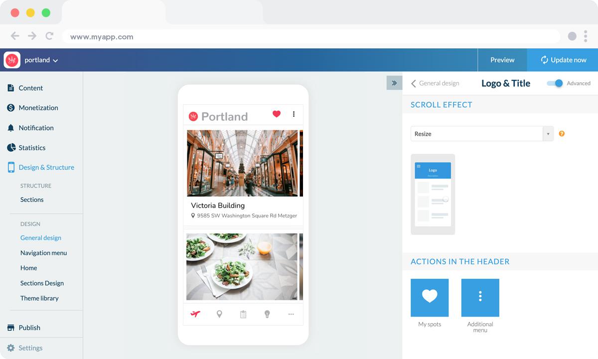
You can further customize your app by featuring your logo inside the Header, on the Home as well as within sections, where each section Header can be customized independently:
4. Add Content to your Tourism app
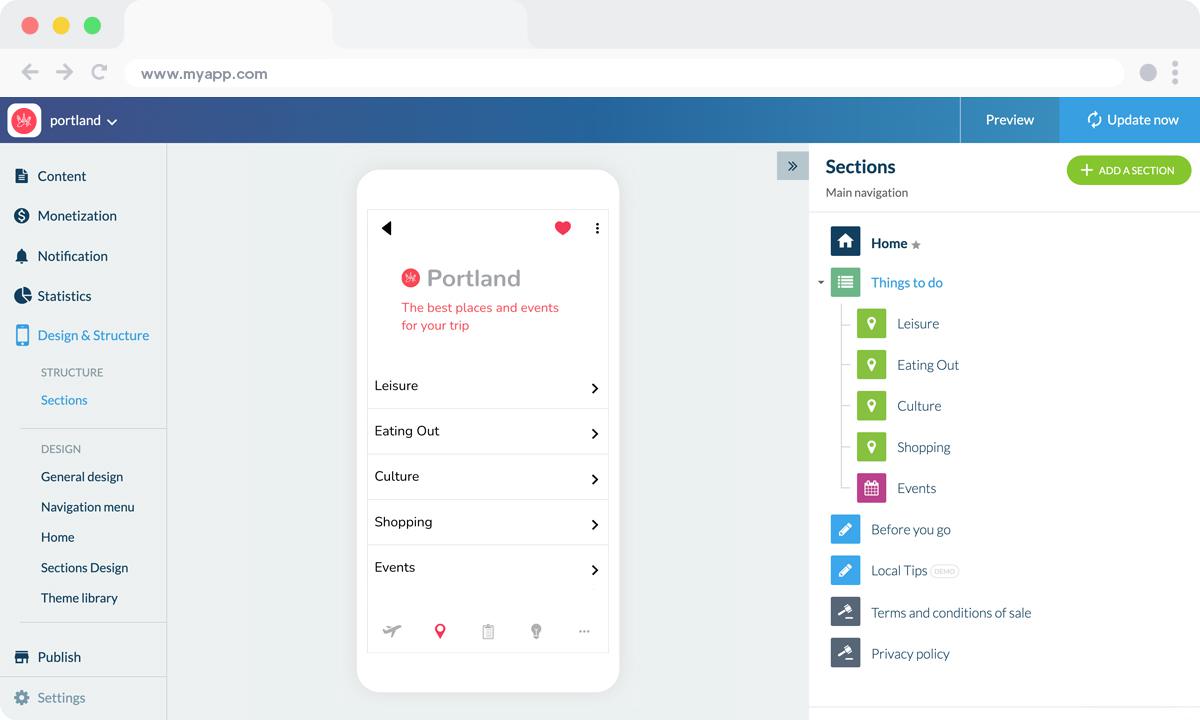
To begin with, I created a sub-menu inside the app (a Menu section), to better organize each type of content, and activities (E.g.: Leisure, Culture, Events ...) that will be presented in this sub-menu, and other information relevant to the app (E.g.: Local tips, Favorites, Send tips ...), which are in the original menu.
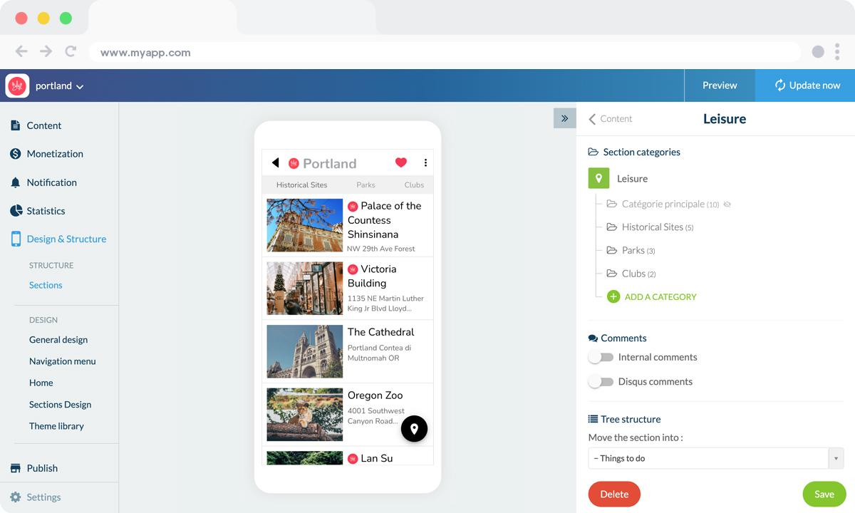
Here, for the Portland App example, I've worked on the "Leisure" section, entering locations within the city, relevant to this type of activity.
Before you start adding POIs (Points of Interest), it is interesting to create categories within this section (such as Historical Sites, Parks, …), making it easier for the users to navigate inside the app and also to avoid creating an excessive amount of sections.
This is a very important step because it will make a big difference in terms of user experience.
The more intuitive and organized, the better.
Once the categories are defined, you can start adding points on the map, in the "Content" tab of the section.
Also, you must choose to which category each point belongs to, in the case of the sample image, The Victoria Building Museum will appear in the All category and "Leisure".
The creation of categories may be performed in different sections (articles, videos...) and is a very effective tool to make the app lighter.
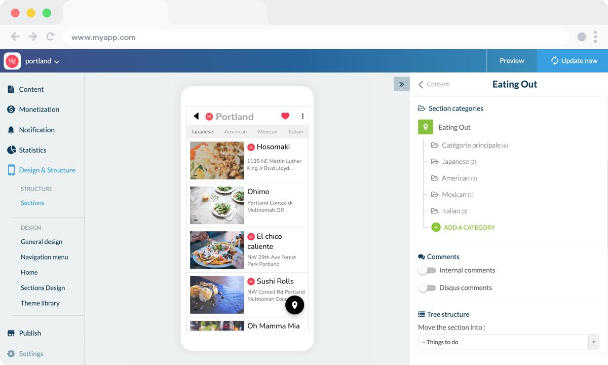
In the "Eating Out" section, for example, we could target the categories by cuisine (Italian, Japanese, Mexican, American...) to keep all information within a single section, while filtering the results.
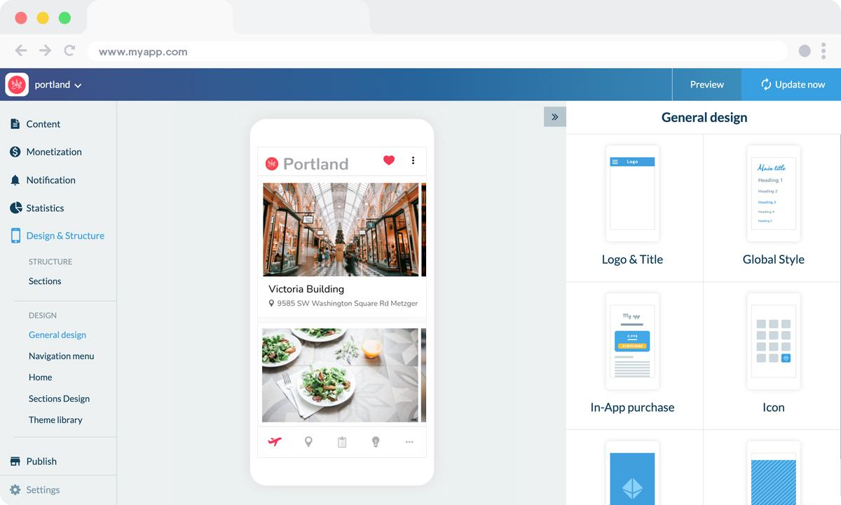
If the content is created inside a CMS section, everything can be done from the GoodBarber back office, from writing articles to creating events.
If you choose to import content from external sources (Wordpress, Facebook, Flickr...), you simply need to configure the settings of the section when creating it - and if you need a helping hand you can check the detailed Online Helps or contact Support.
We're almost there ! Two more elements to add before your app is ready !
5 - Design your Launch Screen and App Icon
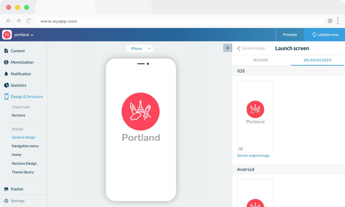
Here, it is important to remember that you need to upload specific images for different device types and operating systems.
This is a setting to ensure an excellent resolution and image quality in the app.
The launch screen is the first thing users will see when opening your app (before the Home).
It will be displayed for a few seconds while your app’s content is loading (in a browser as well).
Here, our graphic designer created the splash screen, but it is also possible to design it directly from the back office, using the Wizard Tool.
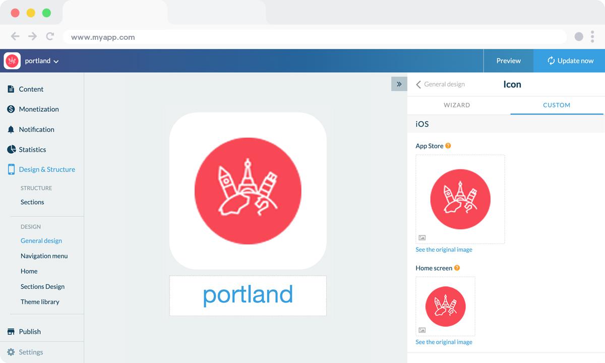
Creating the right app icon can be tricky as you have very little room for creativity, plus it needs to be self explanatory.
For instance, you might need to tweak your logo somewhat, so that it adapts to a square format.
Last but not least, don't forget to enter the name of your app.
The field that appears below the icon preview is the name of the app as it will appear on the Home Screen of the user's smartphone, for today's example: "Portland".
6. Test and publish your Tourism app
Your travel app is now ready! But before sharing it with the world, you need to carry out a series of tests to check if everything is running as you've planned. You’ll need to test all versions of the app that you’re planning to publish (native iOS, native Android, PWA, etc.), using different OS and different browsers as well.
GoodBarber provides a test app you can use to run preliminary checks on your app. The most optimal way to test your app, however, is through its AdHoc version, which is the actual file of the app that will be submitted to the stores that you can download onto and run on your device.
Other options are available: For native iOS apps, there is a specific tool provided by Apple: TestFlight. It allows testing your app before it goes online on the App Store. Android offers alternatives to Testflight.
Once you’re satisfied with the results of your tests, you can move on to the next step: publishing your app
Publishing an app can be a complex and slightly overwhelming process, starting with the mandatory step of registering as a developer on both Android and iOS platforms. The Apple developer account is $99/year. The Google Publisher account consists of a one-time fee of $25. Keep in mind that Apple requires the owner of the content in the app to match the owner of the developer account, so if you publish multiple iOS apps for different projects, each will need to have its own individual developer account.
The process of submitting an app to the App Store is slightly complex and requires thorough preparation. Apple reviews each app before approving them for release. Before you submit your app for review, you will need to provide a collection of information (Icon, app preview/ screenshots) and metadata (the name of your app, its category, a detailed description, and additional keywords for ASO). The review process can take a few days, Apple will notify you by email when your app is public.
For Google Play, after creating your app on your Google Play Console you will need to register the information that will be displayed on Google Play. It includes mandatory information such as title, short description, full description, graphic assets (pictures, app screenshots), category, contact details, and privacy policy. Once the Store listing is completed, it’s time to upload your app bundle. (it contains all the elements of your application). Then follow the guide on the Google Console to deploy and publish your app. If your app is approved it will be released within a few hours.
Luckily, publishing a Progressive Web App is a lot simpler. Hosting is included with your GoodBarber subscription.
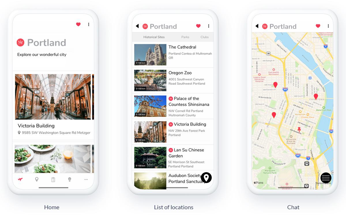
But don't forget that your efforts should go well beyond the creation of your app.
If you need more advice, check out our Ultimate Guide to Promoting your App !


