PWAs - Technology Fundamentals and Powerful Use Cases
Written by GoodBarber Team on

In this article we will dive deeper into 10 fundamental user experiences that make a Progressive Web App and take a look at some applications from companies that are already using this innovative way to build a website. These user experiences, promoted by Google, are the key characteristics to get an app-like experience, regardless of device or operational system. This is the main goal of PWAs.
The web applications of Smashing Magazine, Flipkart, Walmart, The Washington Post and Product Hunt are great case studies to help understand how very specific aspects of this technology work and how it's helping businesses to succeed even more online. Let's dive into it!
Connectivity independence

One of the main characteristics of a Progressive Web App is its capacity to function when the internet connection isn't stable. The PWA runs a script in the background called a Service Worker, the purpose of this script includes content caching locally, allowing apps to be loaded almost instantly. Furthermore, in case the user goes offline, the app can display a custom screen to notify about the lack of connectivity or, in some cases, even deliver content that have been previously cached.
Smashing Magazine is one of the big names in the web industry, publishing editorial content and always on top of digital trends. On the Progressive Web Apps field they are also advocating for it and having invested in this technology themselves.
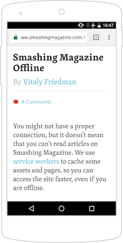
In order to provide a delightful experience for users, even when they do not have internet connectivity, Smashing Magazine allows the app to retrieve and cache data so they can continue on browsing the application in this situation. In the example above, we loaded an article and right after went offline (airplane mode just to be sure), and even after refreshing the page the article was still available for reading.
The development team also thought about the situation where the user hadn't cached a page, but clicked on a link and opened it. Pursuing to deliver the perfect app experience they created a page to tell the user what's going on and how the app is operating under offline circumstances.
Fresh

Once more, the idea is to put the user first and offer a great experience just like in native apps. Providing up-to-date content is a rudimentary characteristic of PWA’s, which is enabled, again, by Service Workers.
After the service worker script has been cached, it not only has the ability to store content for offline use, but also to trigger background syncs to download fresh, new data. Then, when the user has a stable internet connection, the browser can be used to collect and store more information.
Filpkart is an ecommerce company based in Bangalore, India. They are in the forefront of PWA development using it to improve their business KPIs, such as conversion, time spent on page, and user loyalty.
Progressive

To showcase this characteristic I've now opened Flipkart's application in Chrome browser on an Android device. When the page is loaded, we can instantly perceive how the browser UI has adapted itself, changing the colors to match with the PWA. This is a really good example of how the apps can constantly improve by responding to the resources available.
Also in this example, they take advantage of the device's features like vibration, to call the user's attention to specific actions they want to encourage, inviting the user to add the app to the home screen in this case. Beyond that, the background operations of the phone are also running, in order to collect usage data to deliver a better experience for users.
Responsive

To challenge the pixel perfect design of native apps, Progressive Web Apps are extremely responsive, which means that the application layout will adapt itself depending on the form factor (mobile, tablet and desktop) and the screen size, which can range a lot, even just on smartphones.
The behaviour of responsivity can vary based on how the app is built. It can be the block architecture, which we referred to in one of the blog posts in this series, where blocks are arranged and multiplied according to the screen, or single blocks that change internally are responding to size changes.
Walmart is a multinational retailer, whose main goal is to help people save when shopping. Now, on their Progressive Web App, they are offering customers the perfect online shopping experience, regardless of where they are and what device they are using.
Walmart's web page is a great example of how a website can adapt itself, changing the layout based on the user's device capabilities. For instance, on the mobile version, which looks a lot like an app interface, most of the navigation buttons have been moved into the menu, which now can be accessed through a button in the top corner. Also, some of the information and internal ads have been distributed, so it's seems more native for the users. Moving to the other two examples, they are now a lot more similar, as the ratio of the screen doesn't change as much, so only some of the blocks are multiplied and resized.
Still in this case, it's interesting to pay attention to the top banner on iPad and Desktop. While on iPad it invites the user to install the native app, on desktop, some specific promotion is highlighted. This is an example of how the marketing strategies can be adapted for different platforms, and how mobile is an important tool to turn users into premium customers.
App-like navigation

The architecture of a PWA is another crucial factor for its improved functionality, all this following the app shell model. This structure minimizes the page requests as it separates the parts of the app that are often constant, as the menu, header and layout of the pages (which together are called the App Shell), from the parts that are constantly being updated, usually the content.
On practical terms, the Progressive Web Apps imitate the navigation of native apps in order to offer seamless and app-like interactions. For recurring users it means that key elements of the app will be displayed immediately as they are already cached, refining the performance, and the rest of the content will be retrieved during usage.
Following Walmart's case, the design and development team who created the app really succeeded to make their website feel like an app. Looking specifically at the app shell elements, the header has been used not only as a graphic asset, but also to keep the search bar and other buttons that are relevant for users. As mentioned before, now the menu holds most of the navigation buttons of the website, and it has been divided into sections so it is still simple to use. The pages also follow simple block layouts, displaying the content clearly and enabling, all together, the app to load really fast.
Discoverable
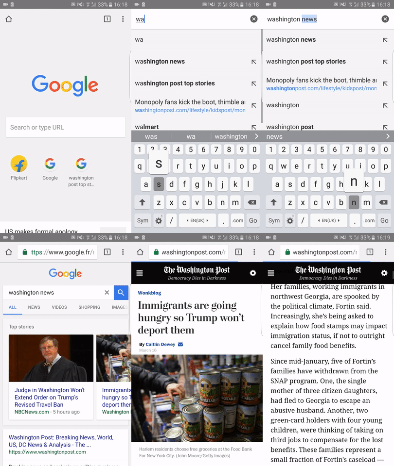
Perhaps one of the greatest advantages over natives apps is the fundamental characteristic of discoverability of Progressive Web Apps. Naturally, as they are built on web pages, it's possible to leverage the power of search engines to index and distribute the application over search results.
From a marketing standpoint, this also means that some search engine optimization techniques can now be applied to apps. This brings a whole new light to user acquisition for apps, and new opportunities to combine with ASO strategies.
The Washington Post, founded in 1877, is one of the most traditional media publishers from the United States. Today, the company is thriving on the Progressive Web App field to increase their reach and digital engagement.
Linkable
Safe

Web security is a big topic on this day an age, and, since Progressive Web Apps are based on web pages, there are some requirements they must meet. To deliver the necessary safety demands for the applications, developers must serve the PWAs on a Secure HTTP, or HTTPS, enabling the encryption of the data transit.
Even if the information on the website isn't sensitive, user's privacy and security are the main concerns when thinking about this characteristic. What is more, with the new specifications made by Apple, for iOS apps, and services as online payments already requiring HTTPS connections, implementing this feature is starting to become a no-brainer.
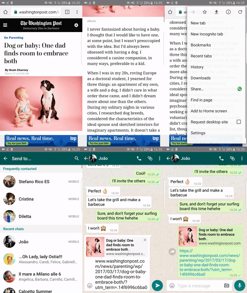
On the image above we can see the sign that indicates that this is a safe page, protected with an HTTPs certificate. On top of the security procedure, The Washington Post went a step further and also made the Paper Validation, which allows them to display the company's name on the navigation bar, instead of the default URL for the page.
Installable

Some may consider the installation process on native apps a negative aspect, as it does require more engagement on the user side. Now, Progressive Web Apps are turning this around and making the whole process a lot simpler, prompting users to add the app to their smartphone or tablet's home screen, reducing the original friction.
With the web app manifest developers can feed browsers with an "install package", which includes graphic assets, as icon and splash screen, as well as information about how the app should behave when launched. Once the app has been installed, it assumes a top level significance, enhancing the overall experience.
Product Hunt 's mission is to let users share and discover new products. Now, with a PWA, the website offers a seamless experience like in their app, helping the community to be more active and engaged.
Product Hunt, as an early adopter by nature, already started taking advantage of this feature and enable users to install their webpage into their smartphone's home screen. The install can be done either with the Install Request Message or from the Options button on the browser, both being simple and quick for the users.
Besides the obvious benefits of being present on the springboard of the device, after the PWA is installed, it progressively gets better, losing the UI of the browser, allowing services workers to respond more efficiently and improving the general user experience. By reducing the installation process friction faced on the app stores, it becomes easier to re-engage users and then convert then into customer or loyal users.
Re-engageable

Another fundamental characteristic of Progressive Web Apps is its engagement features. Previously only available for native apps, developers can now enable push notifications for PWAs, it operates as a background task for the service worker. Currently, the push notifications of PWAs are supported by Chrome, Firefox, Opera, Safari on desktop, but not on mobile. Apps that already implemented this feature perceived a 72% increase on time spend and repeat visits rose by over 50%. (Source )
Besides that, some interactions like top level task switching and the ability to enter in the application with a single tap from anywhere in the web make users more likely to consistently use the app. This is good news for several businesses and understanding how to play with this improvements can be a game changer.
Again, Product Hunt is using the PWA's features on its favour, the example above showcasing the web push notifications. When the users have been on the app for little while they are prompted with the request to allow push notifications on the Progressive Web App, this activate the service worker that, now, is able to send pushes for users, not only on when they are on the app but also when the phone is resting or the user is in different applications.
Assembling all this pieces together and putting it in perspective, what Progressive Web Apps really bring to the table are radically improved web applications that offer the perfect experience for users. So, reliability, speed and engagement are the main takeaways of it this methodology.
As we could see, the use cases for Progressive Web Apps are quite diverse, and surely with more app creators embracing it we will witness the development of a lot more amazing examples. We can just say we are thrilled and with our eyes open for it!